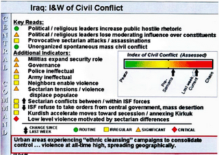
Do we have to assume that whoever is on the receiving end of this briefing is functionally illiterate, or is just really really impressed by bright shiny colours? Look at the pretty reds. They indicate deep, deep shit.
Why not make it vertical, like a thermometer, and declare that Iraq is running really high fever?

7 comments:
preschools also use bright pretty colours
Because the vast majority of Americans are really stupid and need a picture of some sort. Look at USA Today, all pictures, no big words.
I hate to say it, but we Americans are stupid. If you don't put the bright colors in there, it won't hold our attention.
There's a war?
Sorry, gotta go- Lost is coming on...
I'd say the KISS principle is applicable here (maybe to the whole of the US in general). Or maybe they have to keep it simple so George W and Rummy can understand it.
Re: Anne's comment: I've decided to hijack this blog entry because the blogmistress will not bring it up, but - Mr. Ecko - he dead?
Hi anon- I think so and I'm pissed! Feel free to stop by my blog if you'd like to chat about it. Don't want Nan to cyber-kick our butts! :P
Hey Nan- you can make a color-coded chart that lets us know how pissed you are. To Americans, green=good, red=bad...
NO hijacking of threads regarding television shows I don't watch. Git yer own blog. Oh, yeah, Anne HAS her own blog...heh.
Post a Comment